Corporate Brand Identity Case Study for Modular Infratech

·
Client Name

Modular Infratech

Work Domain

B2B
Home & Construction

Client Introduction

Modular Infratech is a civil construction company with a rich experience of more than 30 years in delivering various turnkey projects. They have completed over 250 projects across India for leading individuals and corporations. Their prime offerings are constructing industrial, commercial, residential and corporate projects.

Our Mandate

The Brief

Modular Infratech is a well-established name in the infrastructure niche. With notable work in the commercial and industrial sectors across the country, the client had positioned itself as an affluent and experienced brand. 

The client had incorporated the brand 30 years back, with a traditional approach. No thought went in crafting a brand centric logo, or following a brand identity.

With an aim to widen their audience and to resonate with the latest market trends, the client wanted to revamp its entire brand design.

As a part of this, we were required to create:

  • New logo & Brand Identity
  • Brand Tagline
  • Company Profile 
  • Corporate Video
  • Company Collaterals & Signage
The Challenge
Scope of Work

Our Strategy

The process of visual branding creation started with logo design. Having analyzed the target audience and having done the market research, we started developing variants in different types of logos: word marks, letter marks, combination marks and symbols.

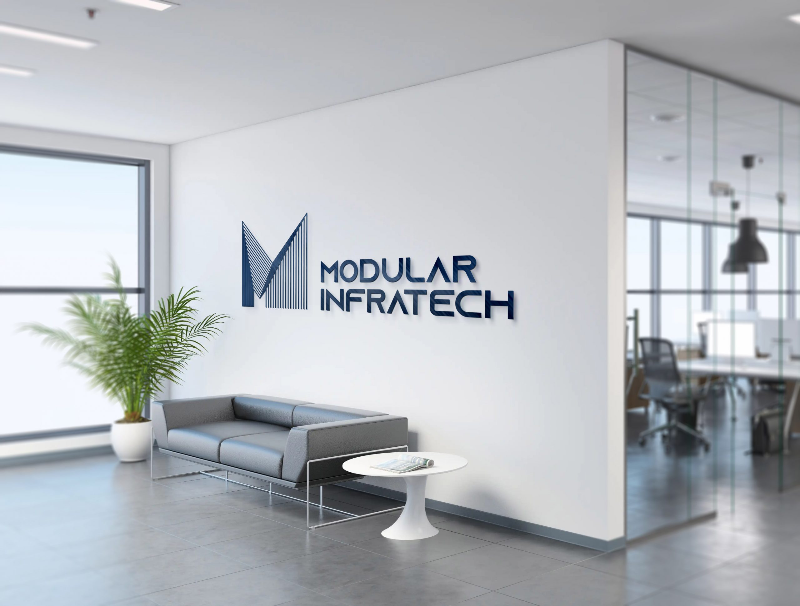
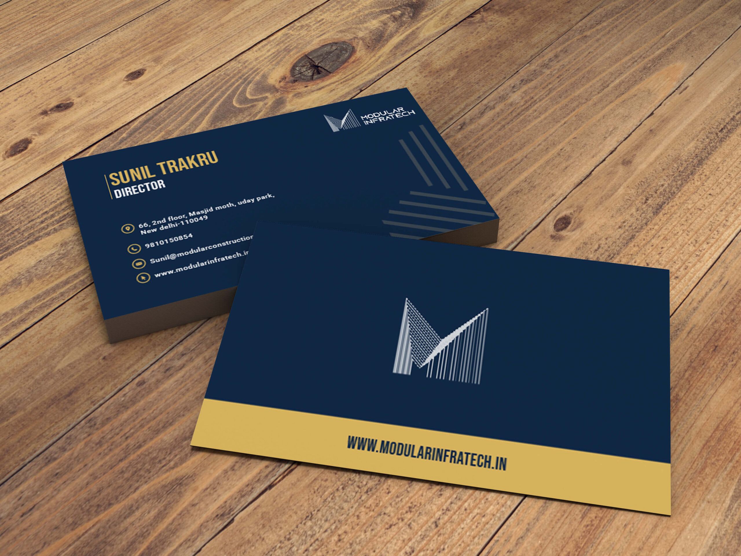
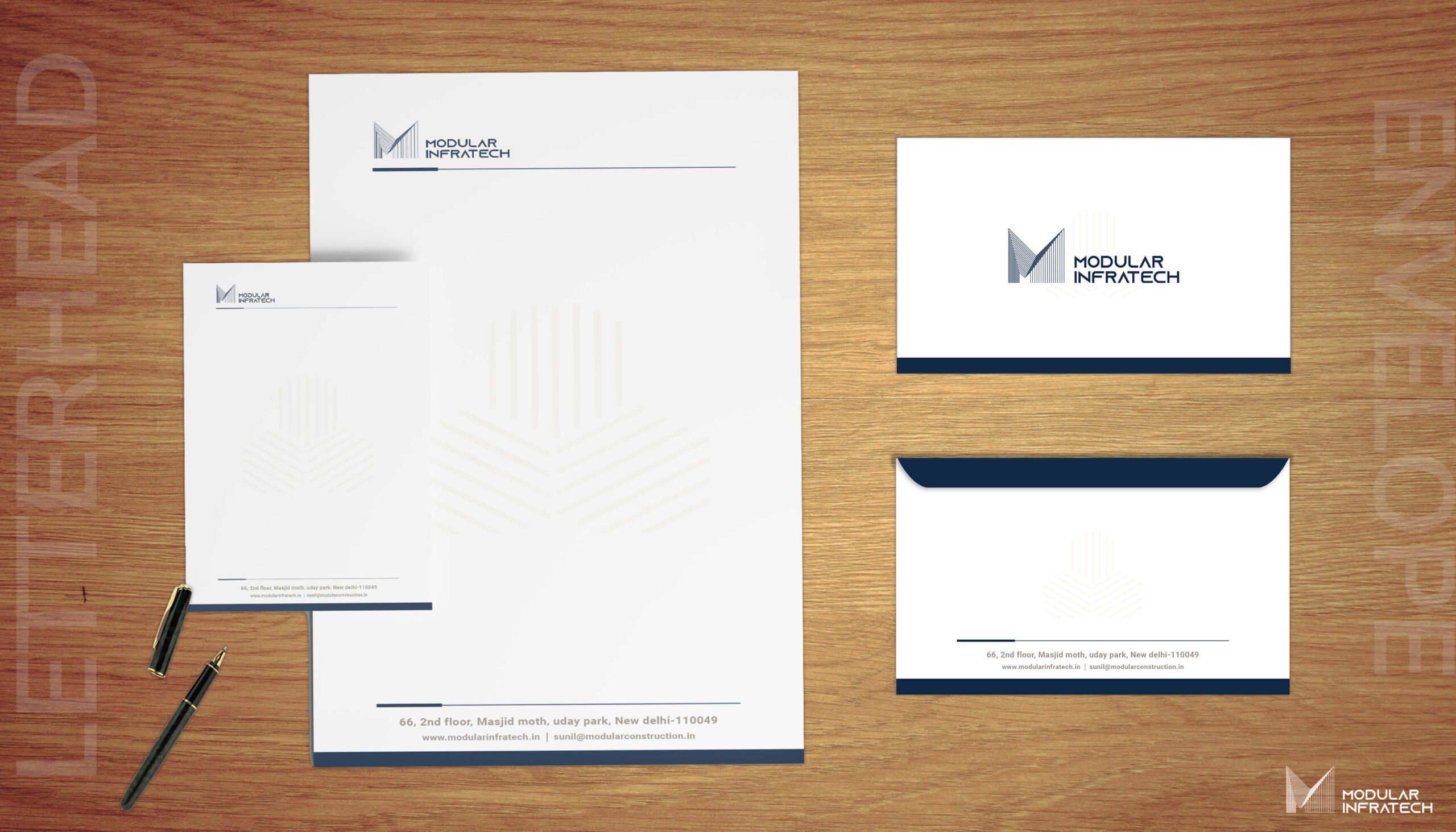
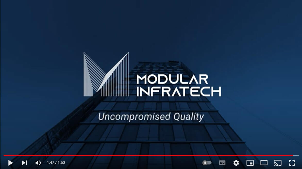
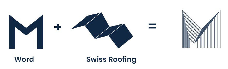
The logo needed to be clear and notable, distinguishing the company from competitors. Hence, we aimed to create a timeless and elegant logo that captivated the audience while focusing on the brand’s voice to conceptualize and use a consistent color approach.

We visualized a logo depicted the ‘Swiss Roofing technique’ which was beautifully inculcated on top of ‘M’ (representing the name of the brand). The logo stood strong and represented the essence of the client’s area of work. 

Brand Identity for Modular Infratech

For the brand’s color scheme, we chose Navy blue as the primary color followed by pastel blue, misted yellow and aluminium as the secondary ones. These colors represented metals which bought a new dimension to the client’s brand. 

Brand Identity for Modular Infratech

Next in line were the tag lines and a brand guidelines deck. The tag line needed to be instilled with a promise of trust and confidence. After much brainstorming, we circled “Uncompromised Quality” which depicted a strong value system of the client. 

We steered our course to overhaul the brand image with a perfectly crisp PDF and an engaging teaser video while reshaping the brand into an entirely new dimension.

Results

As a result, we made a clear brand outline. Instead of a sales pitch, we made concise corporate profile and video that connected the audience with the brand and help convert them.

0 %
Increase in Site Visits
0 %
Increase in Social Mentions
0 %
Increase in the DMs

Concluding Remarks

Branding work for Modular Infratech was exciting yet challenging. The client was already in the industry for 30 years, so we had this huge responsibility to revamp the design per the brand’s authority in the niche. We extensively worked on the teaser video’s graphics and content to make it stand out in the highly populated industry. The logo, on the other hand, was designed keeping the industry’s aesthetics in mind. It had to convey the strong image of the brand and the modernity of the sector at the same time.

Don't Miss Out On Latest Updates

In The Digital Marketing World

Don't Miss Out On Latest Updates In The Digital Marketing World

Subscribe To Our Newsletter And Always Stay Ahead Of The Game

Subscribe to get 15% discount