Jobizo
B2B
Websites & App
Healthcare Staffing
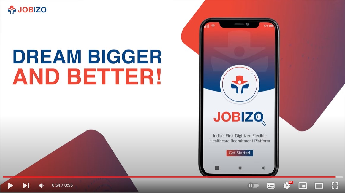
Jobizo is India’s first digitized flexible healthcare recruitment platform, specially designed to cater to the needs of medical institutions and professionals, based on the concept of on-demand/locum services across India.
Jobizo is India’s first digitized flexible healthcare staffing platform. It is a one-of-a-kind matchmaking platform that empowers healthcare institutions and professionals to find each other seamlessly for flexible recruitment needs.
Though Jobizo is a brainchild of our existing and well-established client, IFANglobal, it was a thoroughly new endeavor for us that needed to be populated in the target market.
The client wanted us to create its corporate brand guideline and lay the very foundation of its website design. As a website designing company in India, we took on the challenge to build a robust digital presence for Jobizo, ensuring that their vision of connecting healthcare professionals with institutions was effectively translated online.
The brand’s niche demanded a solid and unique brand design with exciting graphic elements on the website to communicate its uniqueness. Additionally, we ensured the platform was fully optimized for all devices, making us stand out as a responsive website designing company in India. The responsiveness of the platform allows users to seamlessly interact with the website, regardless of whether they are on a mobile device, tablet, or desktop.
Our brief included:
By utilizing our expertise as a responsive web design company in India, we ensured that the website was not only visually appealing but also functionally seamless, providing the best user experience for healthcare professionals and institutions.
The entire process, from brand identity creation to web development, solidified our position as the best web development company in delivering cutting-edge digital solutions tailored to Jobizo’s needs and the unique healthcare industry.
We had to start from scratch since we had no Indian competitor data to study from. Hence, our creative minds deep-dived to comprehend the healthcare recruitment market. Apart from addressing the pain points, we had to focus on the design elements that would work for a business venture based on a novel concept of locum services.
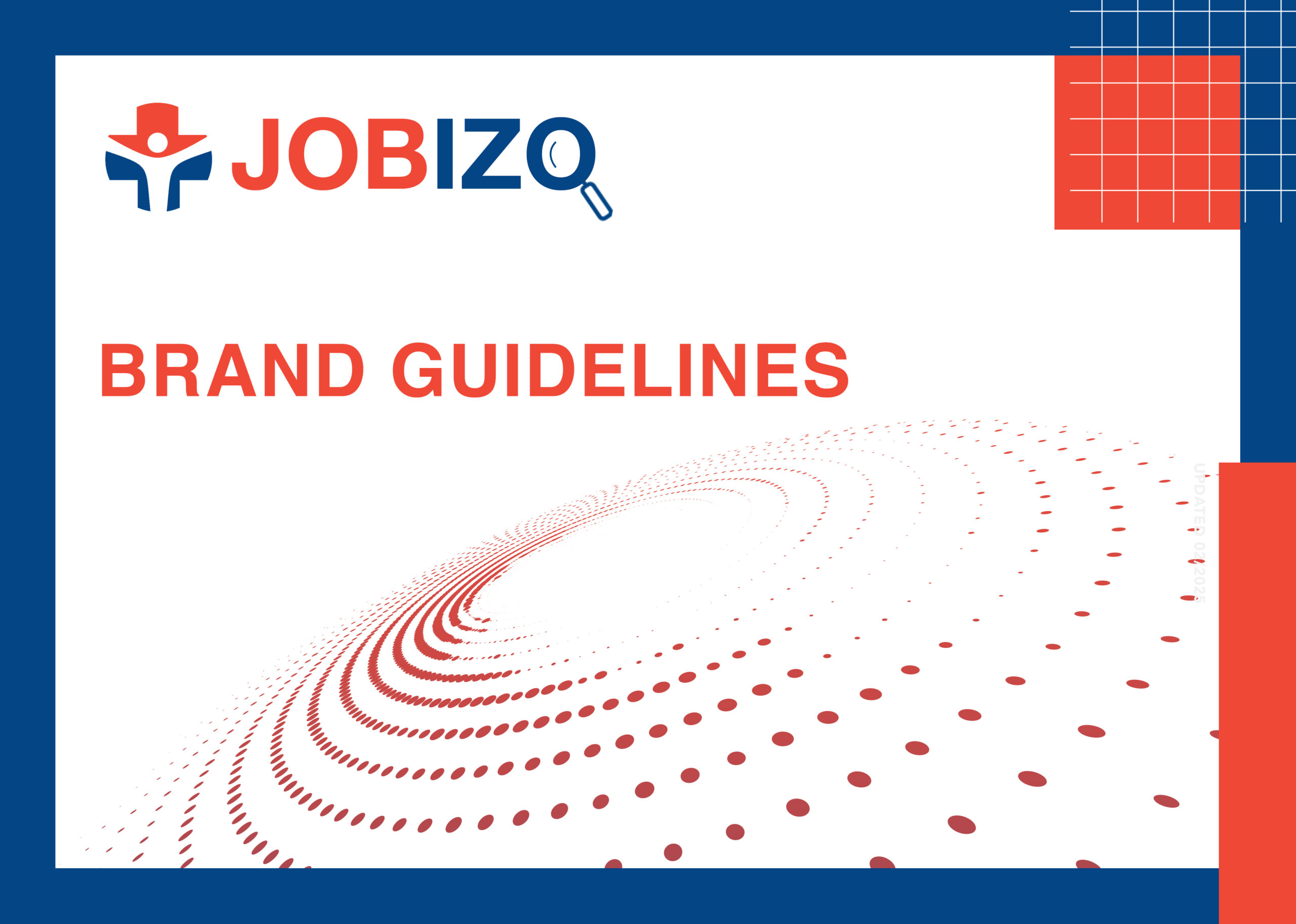
THE LOGO
After ideation sessions and usability testing our design team circled a simple yet effective logo for the client. The logo had to communicate the true essence for the job which was “Leverage Technology To Solve Recruitment Problems”. We cleverly encapsulated it in our logo design.

The primary colors chosen were “Orangey Red” (#HEXf04837) & “Deep Sea Blue” (#HEX034585). These colors were both vibrant showcasing the newness of the brand plus impactful.
THE FONTS
For the font, we chose HELVETICA (Headlines) and LATO (Body) to give a clear and optimistic nod to the brand’s objectives.
WEBSITE
Our entire creative team comprising UI/UX and website designers began gathering more knowledge about the target audience, keeping the client’s expectations in mind. Once we understood the challenges and knew how the client wanted to depict their website, we began strategizing to deliver better website navigation and an excellent end-user experience from scratch.
Our team of creative enthusiasts and website designers collaborated and delved deeper to create a website layout.
UI/UX STRATEGY
Our top priority while laying out a UX strategy was to keep the visitors engaged while they landed on the website. We pulled out all the learnings from the research and learning phase which included a lot of industry and competitor research.
As the central offering was via app/desktop application, we had to make sure that our content nurtured the visitors enough to use the application.
The first thing we focussed on was the efficient sitemap that would simply access valuable information, the visitors were looking for.
The content strategy was simple: Relevant and User-Focused content ONLY.
After the sitemap and the content was in place, we moved on to the next step which was to wireframe the structure of the site. Wireframing allowed us to lay out the priority of content on each page across the site, to ensure an optimal user journey.
GRAPHICS AND IMAGERY
The graphics and imagery across the website shows the action, movement, and change that Jobizo seeks to bring while pursuing their mission, and embodies the audience they target. Even the micro-animations we planned during this phase hinted at the progressive approach of the client.
The wireframe allowed the client to see the blueprint of the entire website structure and enabled us to iterate rapidly to create the ideal user journey.
BACKEND
The entire backend configuration of the website was done on the extremely user-friendly WordPress to make regular updates easy. Extra caution was focussed on making it user-friendly on devices of all sorts and sizes.
THE FINAL TEST & LAUNCH
After all the planning, brainstorming and initial execution, now was the time to test all our efforts.
We took a buffer of a week between the execution and launch to thoroughly test the website.
The testing phase included:
The client was elated with what we presented. After an in-depth industry/competition research and getting into the skin of the end user, we could finally put out something we were truly proud of.
The time spent on the website by visitors has been on the rise month after month. With our continuous updations and optimizations, the bounce rate has significantly reduced over these months.
We continue to facelift the website pertaining to the recent objectives of our client.